Well, we did it. We rolled out both a new brand system and a new site. كازينو حي A lot of hard work and preparation went into the design for both, but I’d like to first talk to you about the brand design, what went into the process, and how we ended up with our new look.
It begins with brand.
We knew that we needed to refresh our website, but we also knew that a good site begins with a very solid brand design system. كازينو وليام هيل This was the first place we started. We’ve gone through a few looks over the years, but none of them ever felt perfect. Our previous script-style mark was cool, but it also had some flaws:
- The script-style didn’t scale down well
- The mark was, in some applications, less than legible
- The whole thing was trying a little too hard
- Most importantly, we never really developed a brand system around it.
These days, a company’s mark needs to work in avatars, favicons, app icons, coffee mugs, business cards . . . . all kinds of places at all kinds of sizes. Our mark didn’t do that well. Additionally, the script could be a bit hard to read in certain applications; again, this is a failure of scalability. Also, while the mark looked pretty cool, it always felt like it would be more at home on a kick drum than a business card.
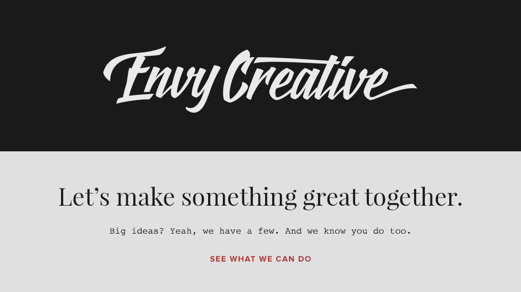
The previous incarnation of the Envy Creative brand design, featuring the script-style mark, Playfair Display, Courier, and Proxima Nova typefaces.
The last point is the most important; our mark was never really, thoughtfully incorporated into a brand system. The logo was slapped onto proposals, invoices, envelopes and other collateral with little regard for the supporting elements like type, color, content, and voice.
Our materials looked good, but we knew we could do better by developing a true identity system.
Our Brand Design Goals and Vision
We set some straight-forward branding goals:
- A mark that includes an icon to serve as a proxy when the full name of our company can’t be displayed
- A unique typographic system that would age well
- A color palette that was fresh and impactful
- A organized brand system that could be applied seamlessly across all of our touchpoints.
So, we knew what we needed, but that’s just one component of a branding project. Our next and most important step was defining what we wanted our brand system to communicate. Thankfully, we all agreed pretty much unanimously on what our brand should communicate:
- Forward Progress
- Minimalism
- A conscious rejection of trend
- Relationships and stories over tech Gimmicks and slickness
- A friendly and approachable voice that was authentic to who we are
With all of that preparation, the actual designing of the system became pretty easy.
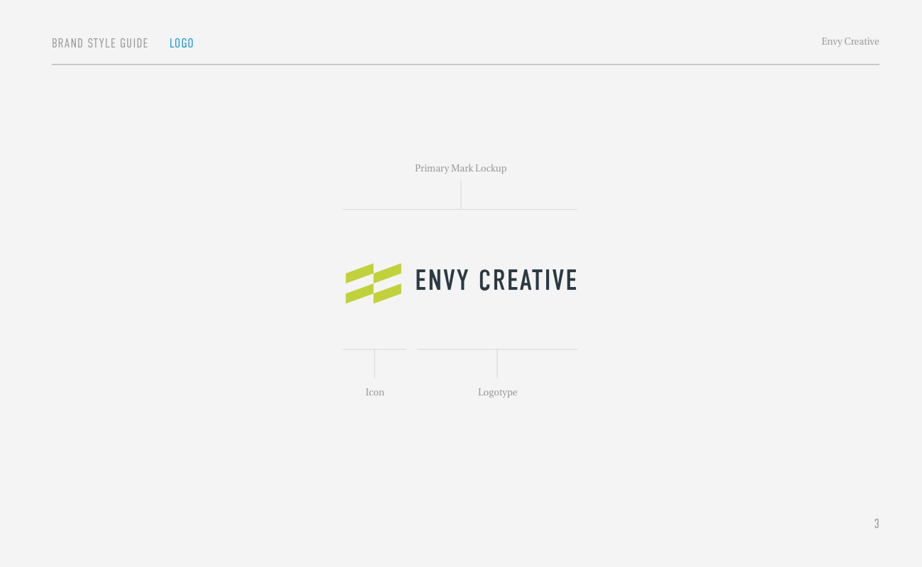
The Icon
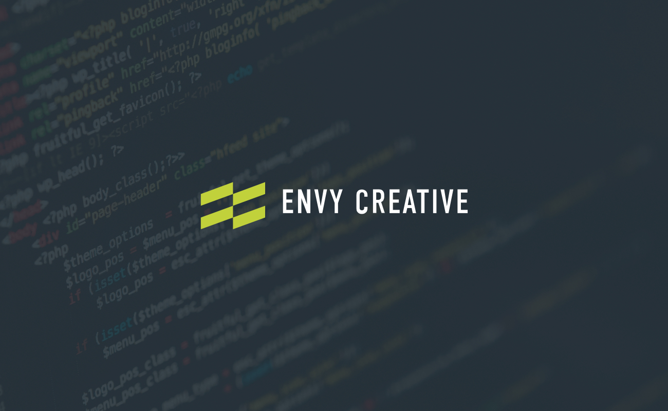
It started with the icon—something we’d never leveraged in our previous identities—and after a few rounds of sketching, a little tweak or two in Illustrator, the mark was defined. The team loved its simplicity, its unique use of negative space (it’s an “E” and a “C”), and its dynamic movement. All of us knew it would scale well and it felt right, it felt like it was meant to be our flag.
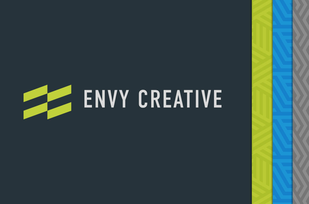
Our icon was constructed from a simple grid, and injected with a jolt of electric green.
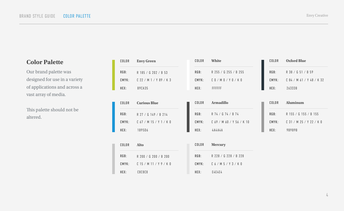
The Color
From there we dove into color. We had used green in a previous mark, and though we discarded it for a black-and-white feel later, we always really liked that green. Sometimes you have to look back in the vault for a good idea. We tweaked the shade a bit, dialed it in for digital and print applications, and now our icon was locked in and electrified. Coolness.
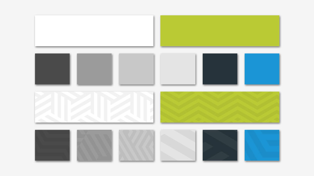
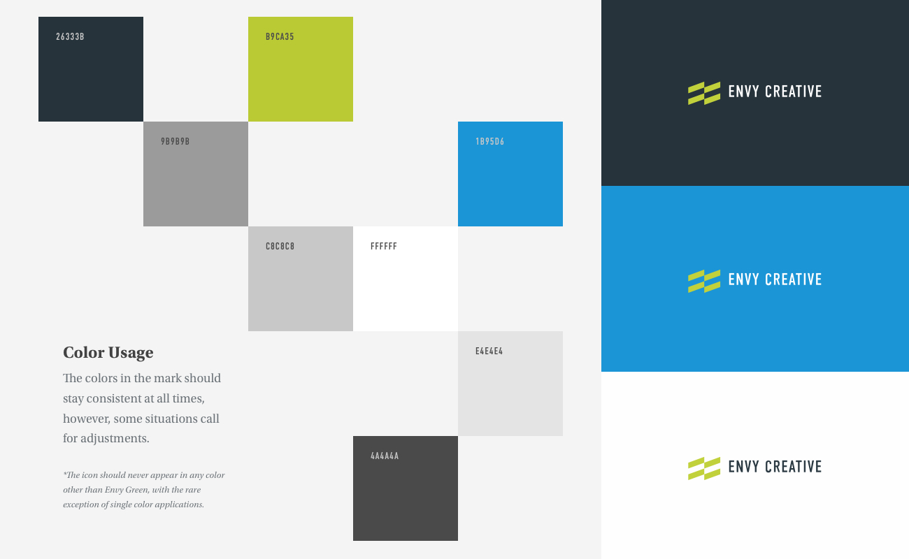
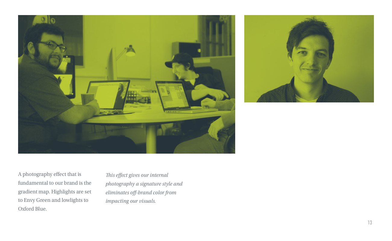
The new Envy Creative color palette, including experiments with patterns based on the geometry of our icon. Brand design systems should continue to grow.
It’s obvious from looking at our work that we’re huge fans of white space. Our previous site kind of bucked that natural aesthetic of ours and used a bunch of darker colors. Not this time. We knew white would be one very large component of our palette and with the new “Envy Green” in place, we tried to keep the rest of the palette muted and in service of our two main brand colors. To further reject our previous dark look, we exiled any true blacks from our brand design palette, and opted for a collection of charcoal and stone hues. We anchored the palette with a deep oxford blue and the slightest touches of the more electric curious blue.
The Typography
The typography selection was my favorite part of the process. I’m an admitted type addict. My FontBook is a well curated collection of some of the best faces ever designed. العب واربح المال الحقيقي I collect type families like other people collect baseball cards or stamps or something else collectible. I organize and catalog, I obsess. I’ve assembled type stacks for projects that leverage upwards of six different faces, often times to great effect. But, I wanted to keep our aim of minimalism central to every component of the brand design. To that end, I settled on two faces in two weights, and a single set of italics.
There is an enormous and beautiful world of type outside of Google Fonts. It’s a great service but, for any designers out there, take a hard look at commercial faces. Pay for fonts. It’s a very good thing. It will improve your work tremendously.
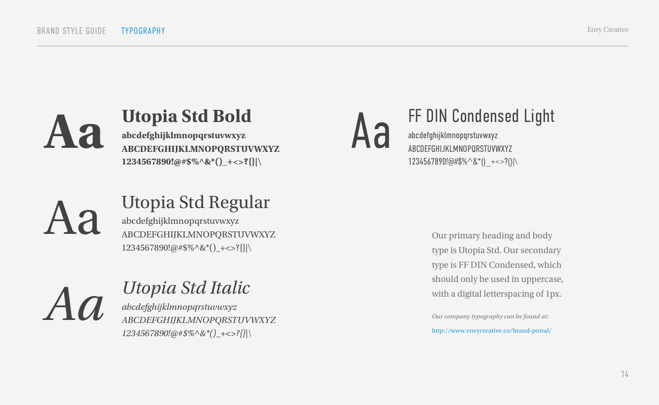
Utopia
The foundation of our typographic stack is the gorgeous transitional serif typeface Utopia. The typeface was designed by Robert Slimbach in 1989 for Adobe Systems. You may know Mr. Slimbach from Arno, Minion, the newly released Acumin, and Myriad, the one-time corporate typeface of Apple, Inc that he designed with Carol Twombly in 1992. We loved the idea of using a serif for all of our heading tags because, quite frankly, slab and sans-serif faces get too much love in that regard. Utopia is widely used in print applications, even some newspapers, and we love the approachable, conversational energy it brings to the table. كيف تربح في الروليت We love it so much in fact that we decided to use the regular weight for our body type across all of our printed and digital materials, as well. Contrast? Who needs it?
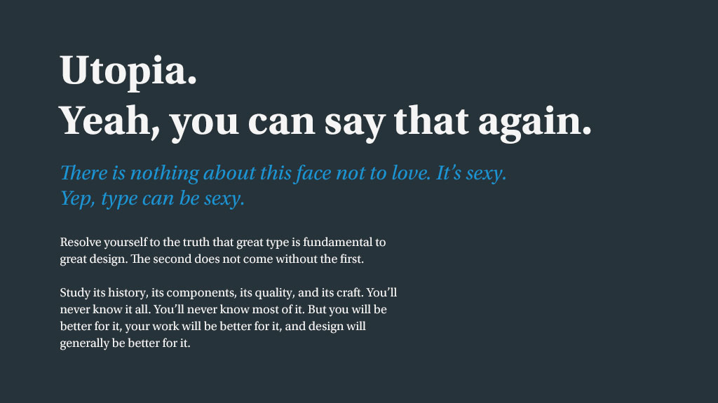
A sample of Utopia, our primary brand face. It’s gorgeous. You know it, I know it.
FF DIN
Well, actually, we did need a little contrast. As a result, for links, navigation, citations, and other little informational bits and pieces, we employed FF DIN Condensed. The FF DIN typeface was designed by Albert-jan Pool for FontFont in 1994. It’s a hugely popular typeface. You’ve seen its normal width in action in a lot of places. Take a look at JetBlue’s identity and livery; FF DIN. Have a peek at the main typeface for Adidas; a custom-take on FF DIN. It’s a workhorse, beautifully designed for presentations in print and on screen. So, we chose the condensed width in both light and regular weights to add a little bit of structured contrast to Utopia’s slightly more traditional look.
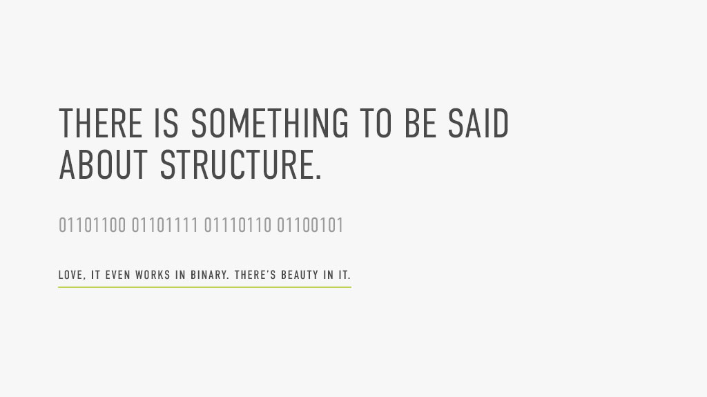
A sample of FF DIN. Tell me that typeface isn’t a thing of beauty. ربح المال من الانترنت مجانا That’s what I thought.
The Voice
Our voice serves as a vital component of our brand. We pride ourselves on being professional and intelligent, making every effort to be masters of our craft. Most importantly, we try to be friendly to everyone we meet, and authentic in every interaction. لعبة جاك We know a lot about web and brand design, we can talk all day about digital strategy, our experience, our successes. But, we’re most interested in our clients’ and potential clients’ stories and their successes. It was important that our voice reflected that. That our voice was our own.
Our clients don’t just help us pay the bills. اربح المال They push us to be creative, thoughtful, and innovative. Bringing our best to them at every turn and with every interaction is our company’s lifeblood. They’re truly inspiring people.
Also, the Envy Creative team loves to have fun. We love what we do and want every project we work on to be a blissful, enlightening, and enjoyable experience for everyone involved. Companies, individuals, institutions, they all trust us with their image, and we take that very seriously. But, we have to be able to crack jokes, laugh at some of our bad ideas, and work together like a team to do our best work for all of you. We hope that’s evident in the words and even the design on these pages.
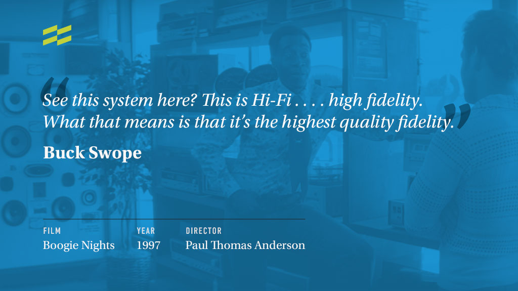
Did we mention we love movies? Between Mike and myself, we could easily do a line-for-line recitation of Boogie Nights. And probably a few dozens other films. We also do the TK-421 modification right here in store, very small price.
Our tribe is also super passionate about the hobbies, interests, and obsessions that we have outside of the office. A criminal-level addiction to movie consumption, an unhealthy obsession with rock n’ roll, a quickly growing collection of exploitation movie posters, an unrelenting and borderline romantic love of the Green Bay Packers; all of these things bleed into our work, into our personalities, and into our interactions.
You’ll see bits and pieces of them scattered throughout the site, even infiltrating our other brand materials. It’s just who we are, we can’t fight it.
A Unified Brand Design System
The components have been thought through, assembled, and now we have a cohesive brand design system that feels uniquely our own. Our team has spent years doing this very thing for companies all over the world, it’s high-time we did it for ourselves. The collateral, if I may say so, is beautiful. It’s simple, clear, professional, and engaging. We’ve pulled together the components that will drive our brand for years to come.
The single best part of the whole process has been our entire team’s renewed focus on our business. We’ve always been hungry to deliver the best for our clients, so hungry in fact that our own brand took a backseat to a massive amount of client work. سباق الخيل مباشر At the end of the day, that’s a great problem to have. However, our fresh facelift has renewed our energy for living the values that our brand design and the hard work that went into it communicates; a desire to deliver the best, most thoughtful, engaging, and powerful brand design, web design, and digital strategy for our past, present, and future clients. And, most importantly, to have a whole lot of fun along the way.
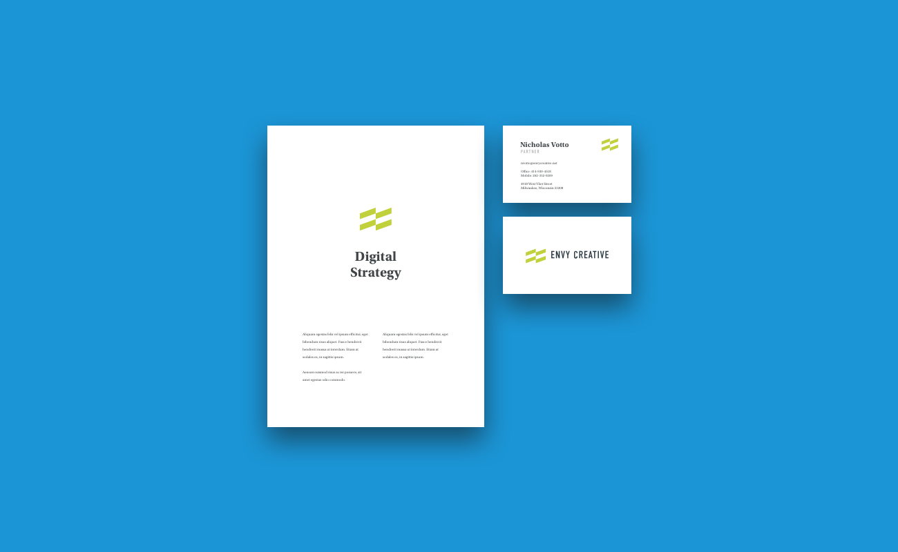
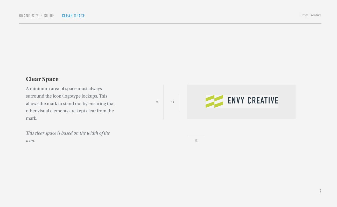
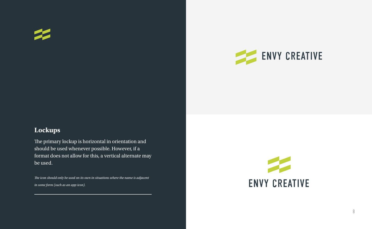
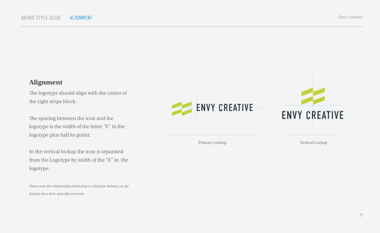
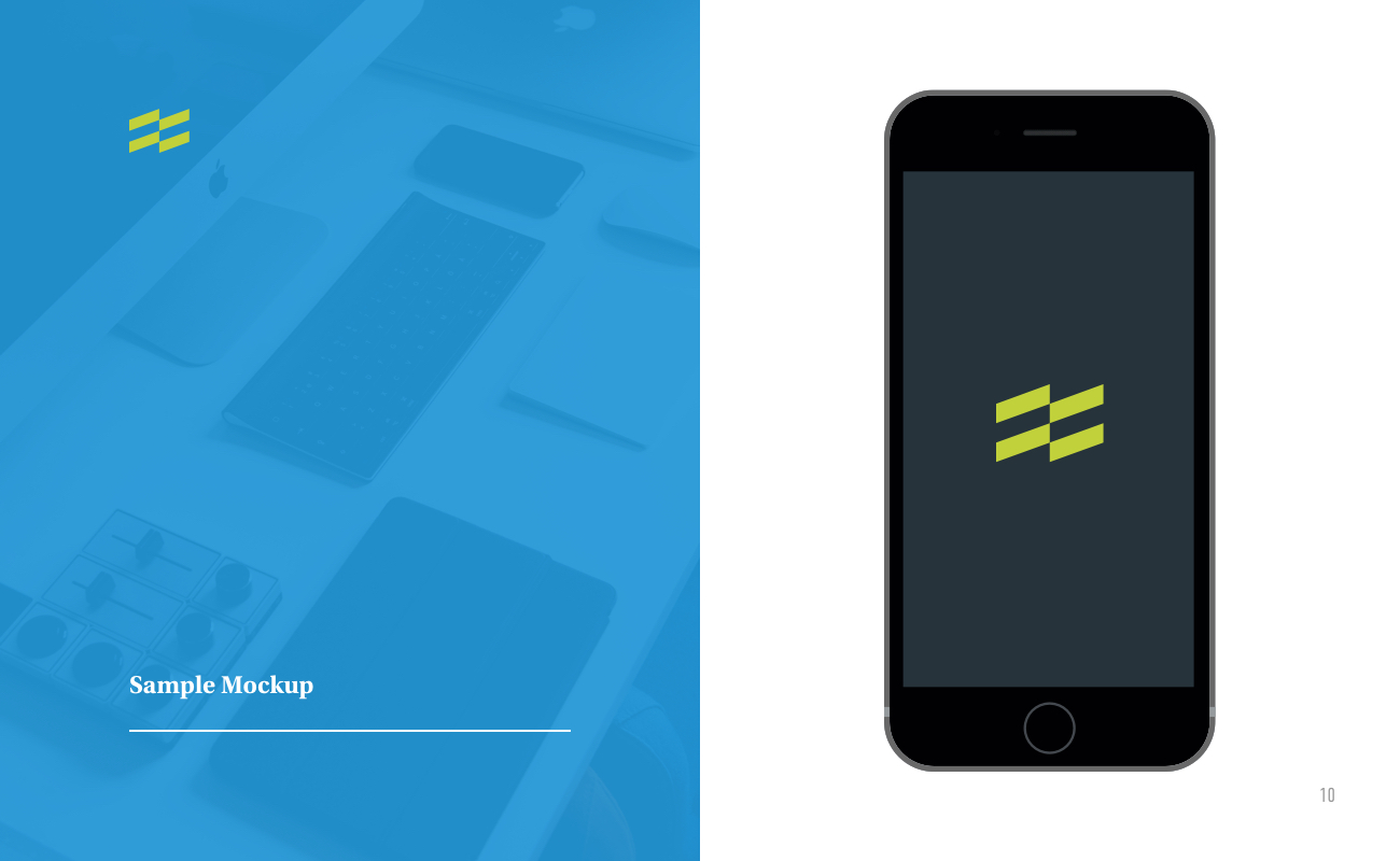
In the coming days we’ll be posting an in-depth look at the process behind our new web design. لعبة اون لاين We’ll also be digging into some of the awesome technologies we’re using for analytics and hosting. For now, we’ll leave you with a few pages from our new brand style guide. This is similar to many documents we’ve created for brands we have designed for our clients. It is incredibly helpful to have an excellent visual reference on-hand for creating visuals and messaging that are vital to your brand.
We hope you’ve enjoyed this look into our process and we sincerely hope you enjoy the new brand as much as we do.