We made our first one page site design back in 2011. It seemed odd then because we were utilizing the preferred design principles of app developers for a small business/organization website. We made two or three one-pagers for clients, they worked beautifully, and we felt like we were on the bleeding-edge of web design.
But then…nothing. The long-held web design principles were held a little tighter, and our one page sites seemed like such an oddity in our portfolio next to more traditional fare.
Fast forward three years, and now one page sites are EVERYWHERE. Seriously, you’ll run into one about once a day. كازينو حي So why now?
It All Started With Your Smartphone . . .
To understand this new phenomena, you’ll have to look back at patient zero: apps. For the most part, websites for phone/tablet apps are a necessary evil for developers – they know they need one because you have to push people who aren’t engaging with their business on a mobile device to relevant information about their product. وليام هيل And nothing ticks people off more than being redirected to the Apple App Store on the web – gross.
It was a natural pairing of content and form because apps are easy to write about: features, pricing, and purchase. That’s about it. Here’s what our app does, here’s how much it costs, here’s where you can buy it. اربح المال Funny thing though: that’s a typical pitch used across most industries. We can ultimately reduce down what we do to a couple of sentences and deep dive when necessary. المراهنة The app guys understand this, and, early on, their simplistic products found a perfect partner in the one-pager.

Since we’ve been around, mobile has grown from 2% to account for almost 30% of all US traffic.
The Way We Interact With The Web Has Changed.
Back in 2010, barely anyone was looking at the web through their phones: only about 2% of traffic in the United States was coming from mobile devices. Nowadays, that number is closer to 30% and in some industries we are already seeing the tipping point in the battle between mobile and desktop (the restaurant/bar sector’s traffic favors mobile now). What does this have to do with one page sites? Well, the more time people spend on their phones interacting with the web, the more likely their habits will change.
It used to be that keeping assets “above the fold” was paramount to great web design…not anymore. People are more comfortable with scrolling than they ever have been, so this has afforded designers more vertical room to work with. Even nested menus are going the way of the dinosaur, as users rarely stick around to tap through convoluted menu structures on their phones and tablets. The mobile revolution is an upheaval of several closely-held design and function beliefs, and the one page site is often times the perfect solution for businesses and organizations looking to be on the cutting edge of the web. كيف تلعب بوكر

We employed a simple one page site design for I’m Ready Warden, an experiential web property about the death penalty.
One Page Sites Are Emotional and They Tell A Story Clearly.
When you go to a site and look at the main menu bar, please know that hours of time went into how those options are arranged. كيف تلعب بوكر You might know it as a sitemap or you might here us refer to it in the realm of information architecture, but it is one of the cornerstones of proper web strategy. The overarching aim of IA is to keep you on the site longer or get you to desired information quicker. Using this ideology, one page sites do this but not through a hierarchy of pages, but instead with the content itself. العاب قمار مجانا العب واربح المال الحقيقي سباق الخيل مباشر Suddenly, your site isn’t an encyclopedia of what you do, but is instead a story about how you can help. This is particularly effective in the space of non-profits, who require an emotional investment by contributors to see the best fundraising results.
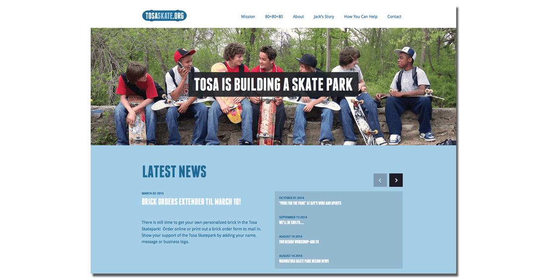
One of our first non-profit clients, Tosa Skateboarders United, were in the process of raising funds to build a skate park in Wauwatosa, Wisconsin. They were running frequent events throughout the community to get the word out and collect donations, but they needed a place for people to better understand their project. We were tasked with creating the online sales pitch for TSU, and almost immediately we gravitated towards a one page design. The personal story behind what spurred this group to push for a public skate park had a lot to do with it, but also because this was a story without an ending. The light at the end of the tunnel was a completed skate park, so the site design had to communicate this feeling of forward momentum. ويليام هيل ربح المال من الانترنت مجانا

One page sites also allow you to think of design in a more compartmentalized way. Early on, TSU wanted to highlight news and events, but as they got closer to their goal, their priorities would change. Soon, events would be replaced by donation campaigns or milestone announcements, and next month’s strategy could upend everything. The one page design on TosaSkate.org allows for the organization to freely change the narrative whenever they want with ease. The end game is to have this site capped off with directions to the completed park, and TSU is well on their way to seeing that become a reality. And the narrative layout of their site is helping them inch closer to their goal by appealing to our better emotions.
Is It A Fit For Me?
Well…it depends. With almost any design trend, it is smart of you not to rush into things too quickly. I know I made one page sites sound so romantic but if applied to the wrong business or organization, then it can be a logistical nightmare. كيف تربح في الروليت If you are planning to sell products online, we’d recommend avoiding the one-pager unless you are selling one or two products in total: a one-page shopping experience is not the norm. Do you require intricate information to sell your services to prospective clients? Then a one page website is not for you. Ultimately, you have to look at what you do and ask yourself: could I sell my product or services in two minutes or less? If you can’t, then move towards a more traditional design scheme.
The one page site is perfect for those looking to make a visual and emotional impact on their users. For this reason, it is a great design choice for non-profits, special events, civic organizations, designers, photographers, and small businesses that provide straightforward B2B solutions. If you feel that you are in this group, maybe it is time to entertain the one page site. You won’t regret it.
About Michael Votto
 Michael is Partner at Envy Creative and serves as Lead Developer. Since 2010, he’s been an advocate for one page site design and has managed several projects where a one-page design was implemented.
Wondering if your next web design project should be a traditional or one page site? Contact Mike and Envy Creative today.